Responsive web design is the approach that suggests that website development and design should respond to the behavior and environment of the user. This includes screen size, platform, and orientation.
Let’s talk for a moment about the growing body of proof that undoubtedly shows how responsive design is one of the important factors that could make or break your business online.
First off, depending on your audience and industry vertical, mobile users could account for up to 70% of your email opens.

Furthermore, the typical smartphone user today checks their device an average of 150 times per day—that’s 150 opportunities for you to break through and convert a prospect to a customer!
Google announced earlier this year that mobile searches now exceed searches done via computer. Specifically, Google said that “more Google searches take place on mobile devices than on computers in 10 countries including the US and Japan.”
With its responsive interface, OnlineBookMe.com leads its users to better user experience. A major factor indicating the quality of user experience is the time they spend on your site. If they find it hard to navigate or use because they’re forced to constantly pinch and zoom, they won’t stay on your website.
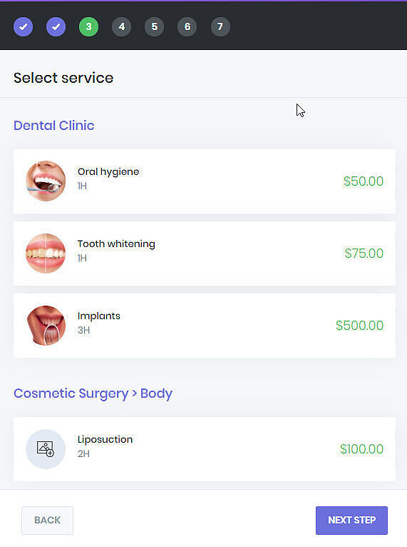
But if your website scales and responds to the change in screen size, then visitors won’t have problems accessing menus, links, buttons or filling out forms. As a result, their user experience will be better and they’ll spend more time on your site.